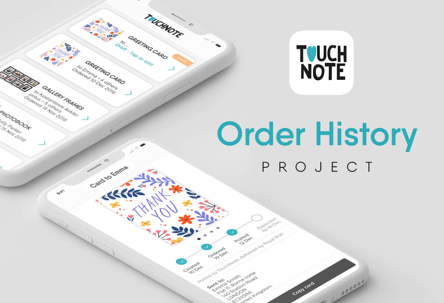
Order History
The redesign of TouchNote’s order history has been one of the most ambitious projects to date for me and the company. Firstly released on web, it has been very appreciated by users, leading to a steep reduction of the number of customer support tickets under tracking topics and and a higher % of customers completing card purchases.
I led the design working alongside the Product Owner and the Core Squad from the early steps. Once the concept was defined, I directed the design team on the delivery of the design scenarios, prototypes and animations. Eventually, I also worked closely with the developers, providing support during the development and testing phases. The design project was completed during approximately 3 sprints, from the conceptualization to the final implementation onto the three app platforms.
invision prototype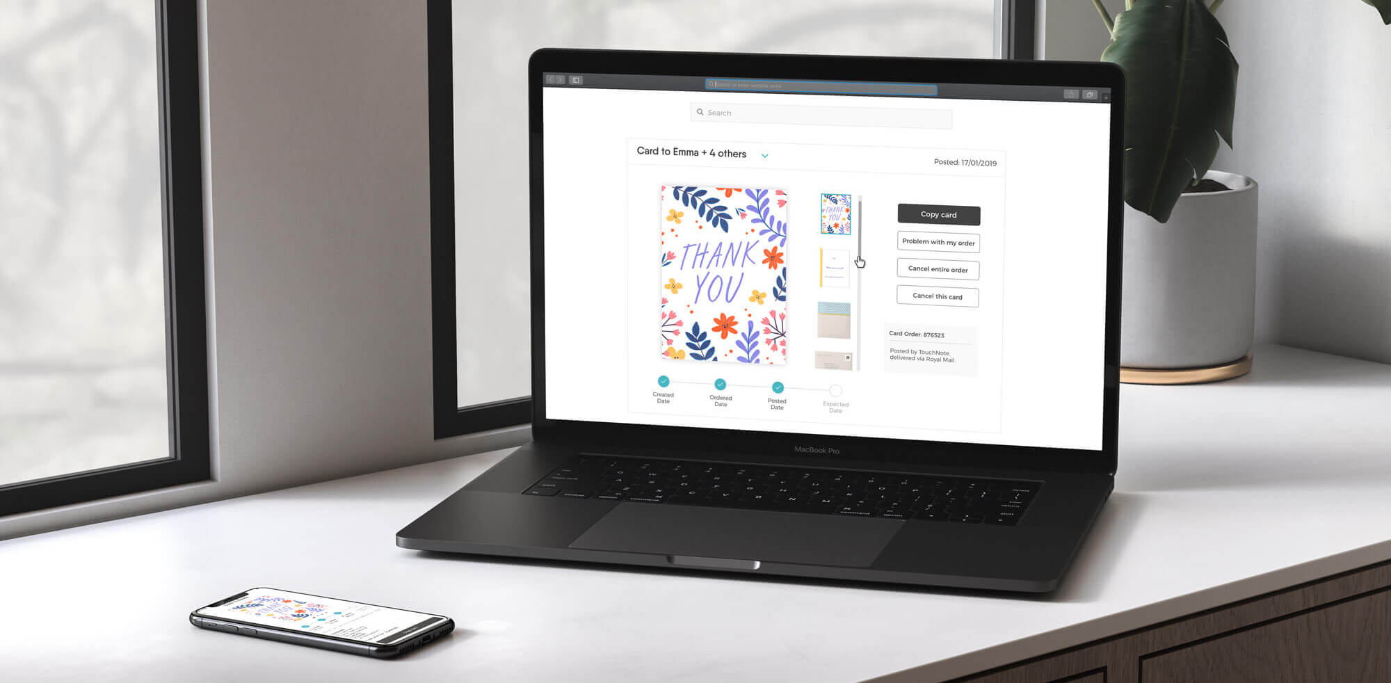
The challenge
Similarly to most e-commerce services out there, the Order History is a core experience within the TouchNote app. It keeps full record of the purchased products, providing the users with detailed updates on the progress for each order. The old section had been live for just under 4 years at the time, and following a deep analysis of the user’s behaviour, along with the statistics from the support team, we really felt the need for a complete restructuring of the whole experience.
Insights
The skeuomorphism of the view and the interactions built within it, made it difficult to browse through products or even multiple recipients for an order. This was particularly challenging for the users, as every product had a different preview on this page according to its real physical form, meaning buttons would be located in different places for each, lacking in consistency.
“How can I easily go through my multi-orders?” Jacqueline,
Android app user
“How can I keep track of my order?” James, web app user
When it was first implemented, the previous Order history had been tailor designed with postcards in mind, where following the shipping progress was not possible. The launch of more complex Touchnote products which came with a higher price tag, however, prompted the users to request a tracking system to remain informed about the status of the order. The system was implemented and added to the already existing page, creating the incongruencies described.
The study
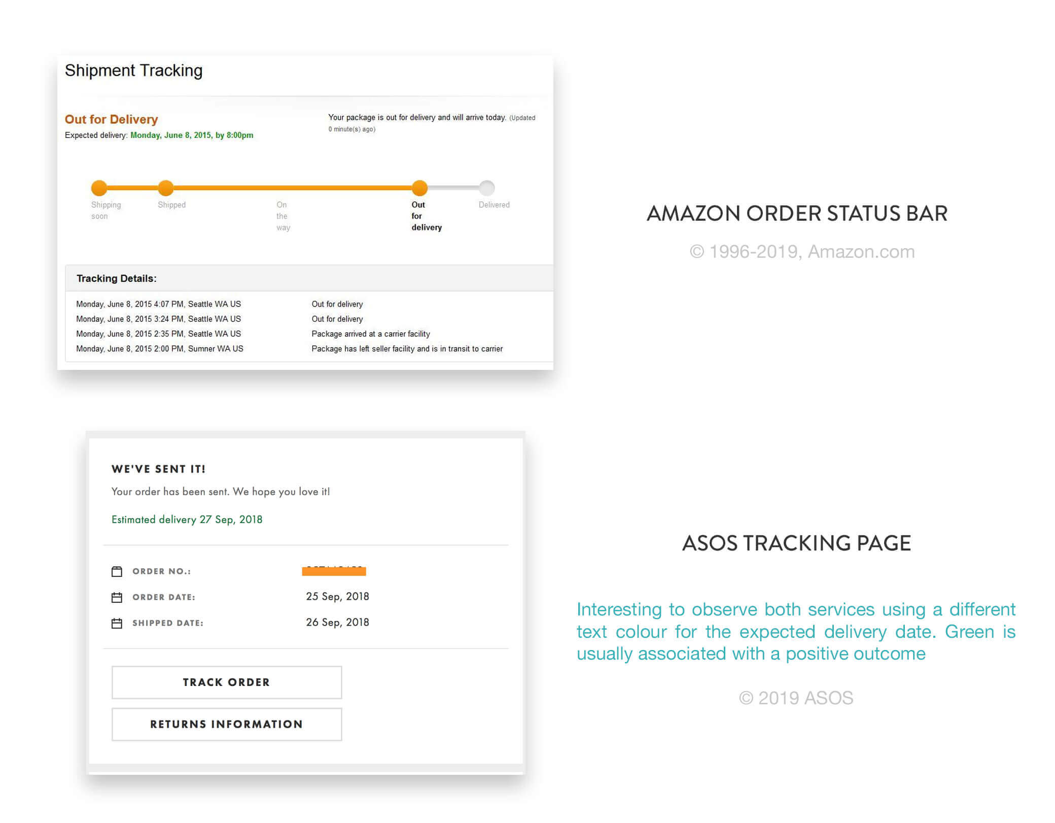
Following some analysis of the competitors’ implementations,
case-studies and countless drafts and user interviews, we
defined a couple of key points required:
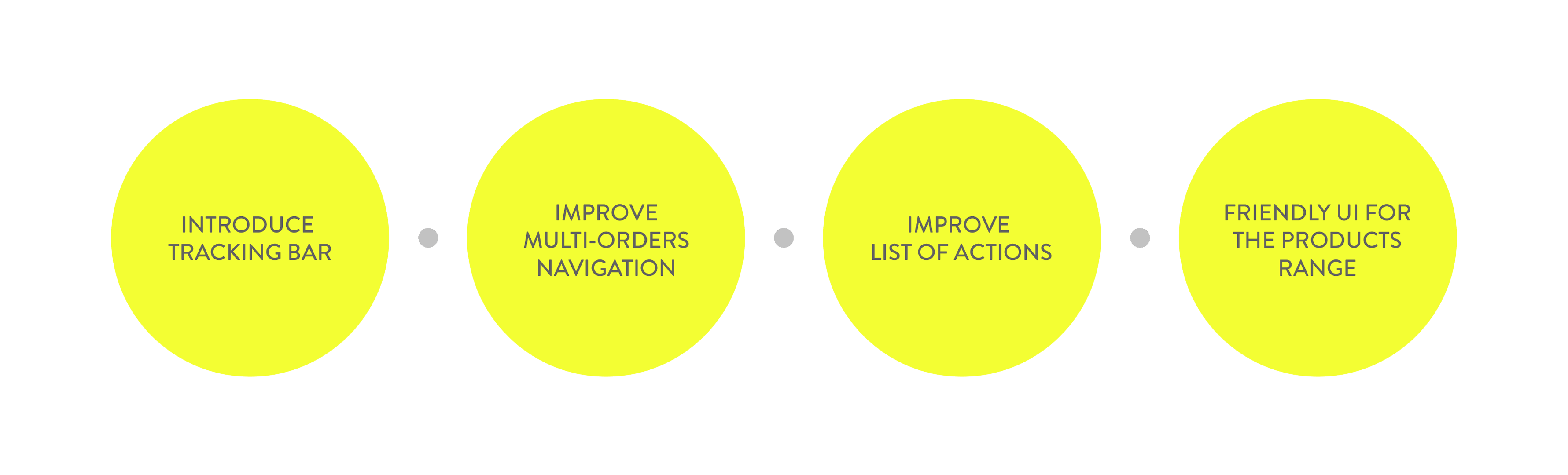
Introduce a brand new trackbar to keep buyers informed after their purchase, which would also consequently reduce the complaints on the customer support channels
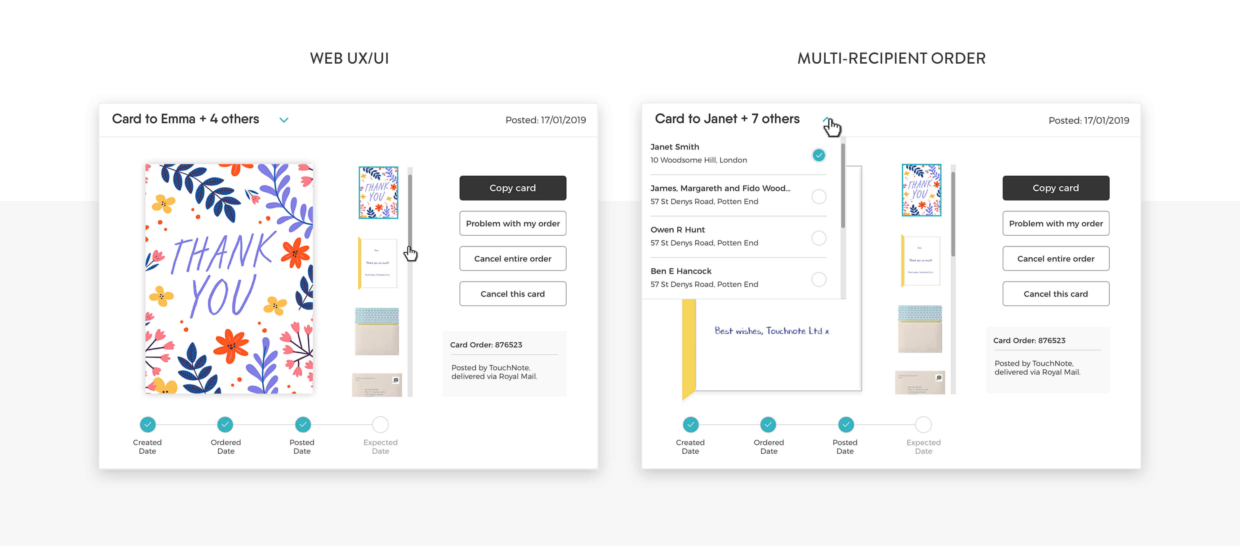
Rethink a way to display multiple recipients orders, stepping away from the previous templates customly built for each product
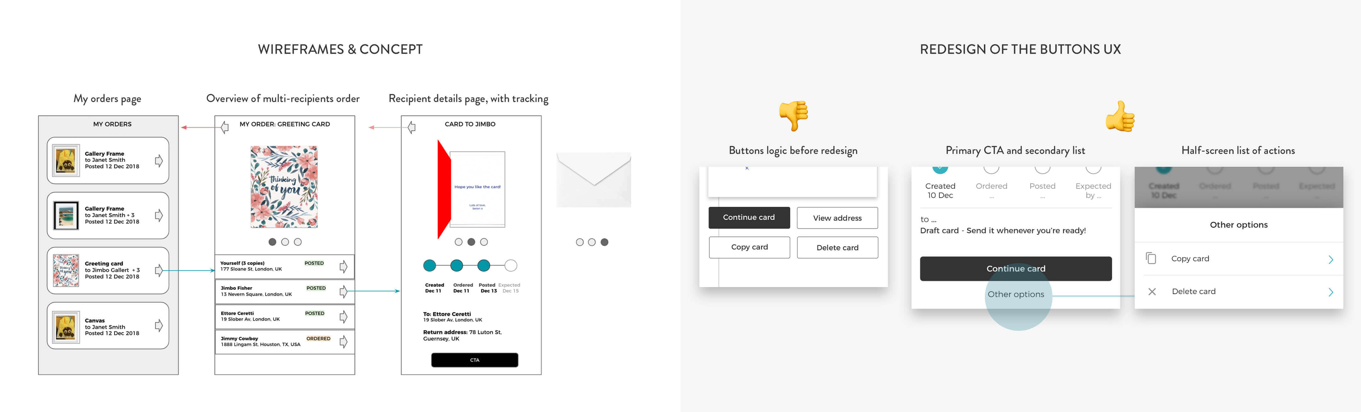
Reduce the number of buttons to improve the User Experience and speed up the decision making of the users, through a new list of actions taking up half screen
Make the UI similarly friendly for the whole range: Touchnote sells a variety of different products, and it was deemed necessary to create a structure and layout ble to provide the same great experience and consistency across all order types.
Wires and design
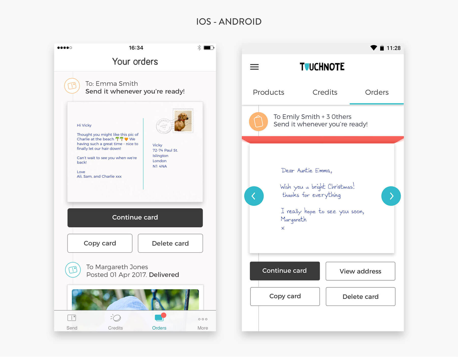
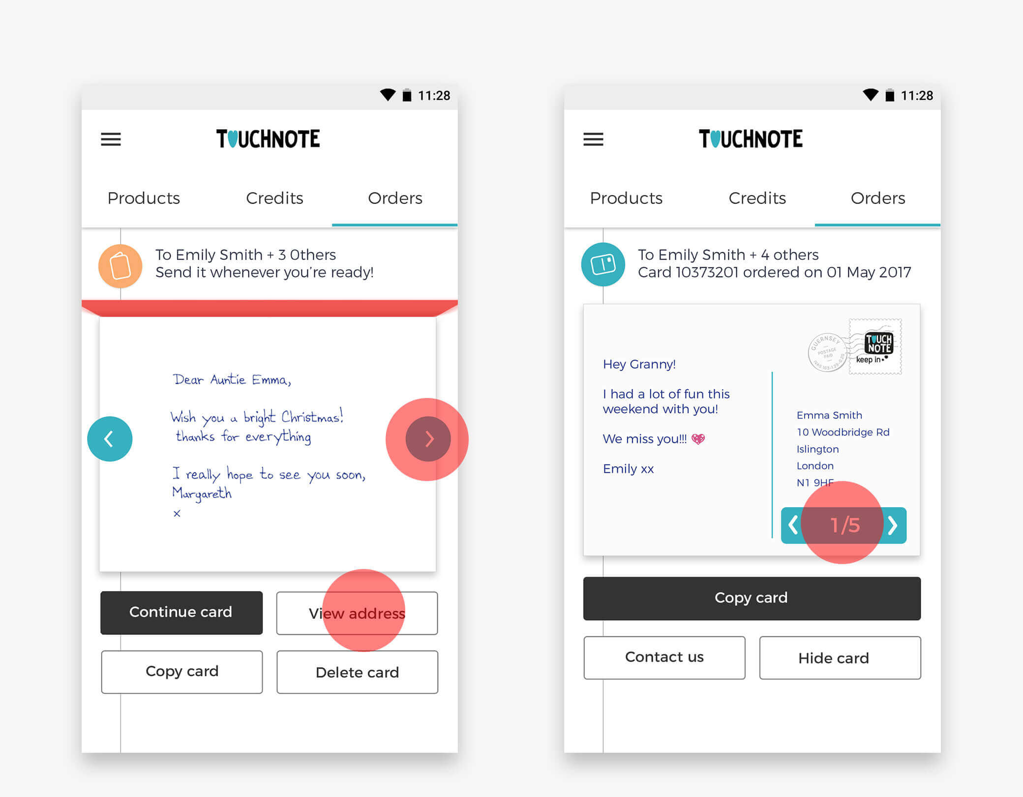
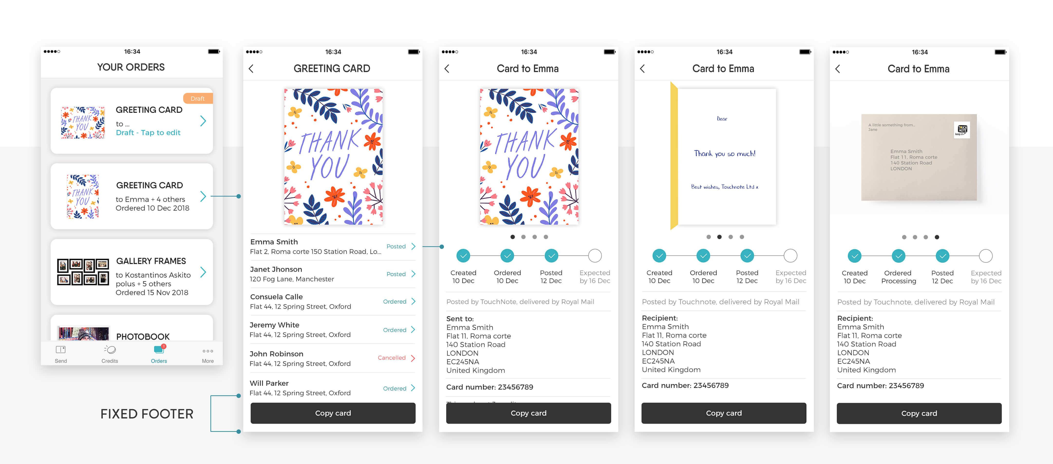
The project involved several wireframing iterations and concepts: below an example of the three-click pattern which demonstrated successful during the testing phase. The first screens showcase all orders along with the most essential information regarding their status, and an example of a detailed page with product details and multiple recipients. Selecting any address would bring over a full tracking for that particular shipping and a carousel with some previews of the items.
The picture below shows the final iOS flow. An Invision prototype is also available following the link at the top of the page.
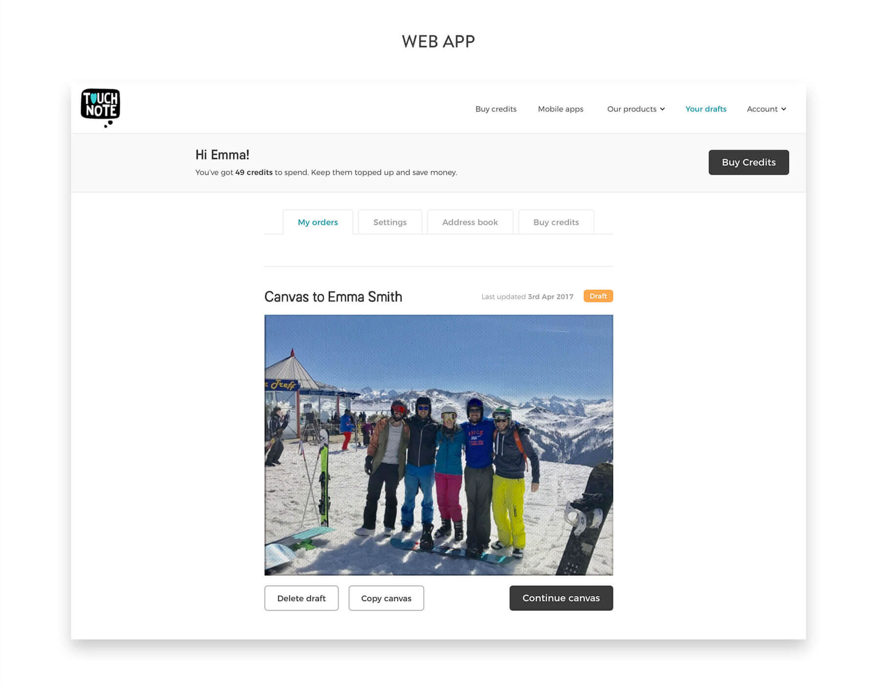
The picture below shows some details of the web implementation, and how the structure has been optimised for a bigger layout when additional horizontal space is available.