Design rebrand
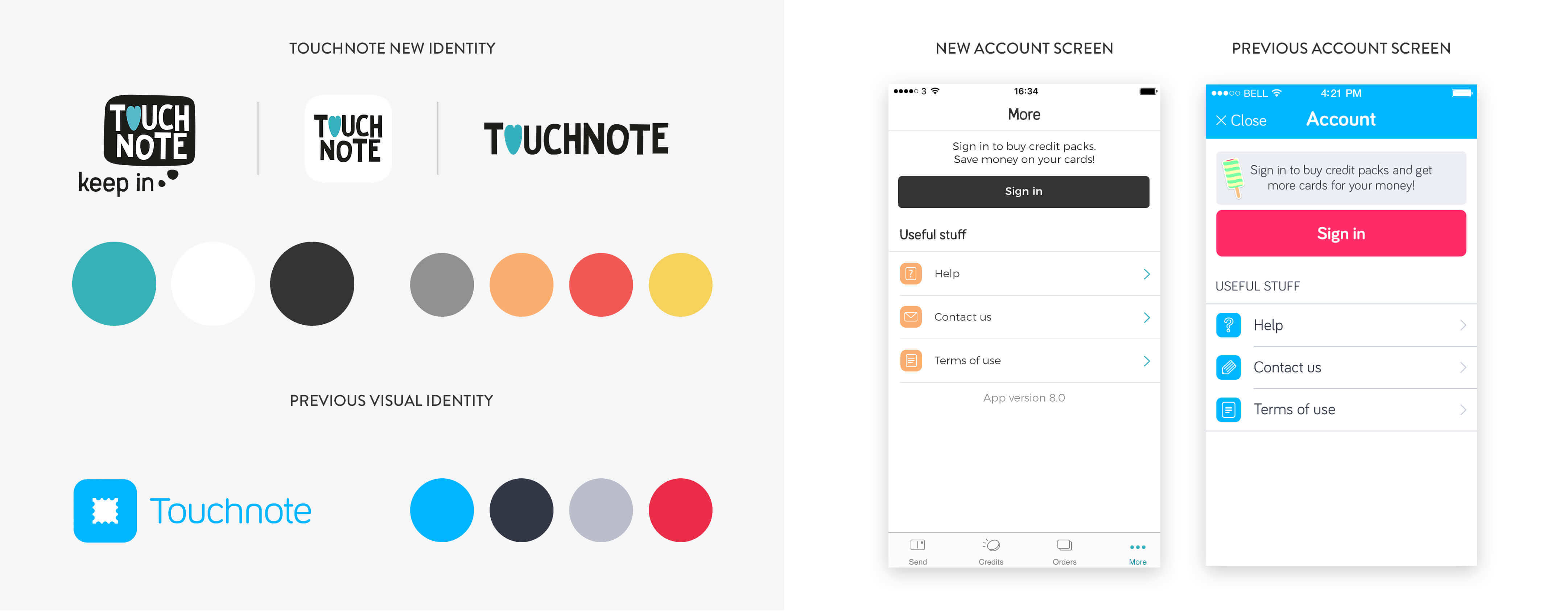
TouchNote rebrand is the result of a year-long project to get to the heart of what TouchNote had become over the years to the team and users. Touchnote started out as a quick and easy way to send photo postcards through an app. As time went on, we spoke to the people who loved using the app, and it was clear that TouchNote was so much more to them than just sending cards, it was all about being thoughtful. This process gave me opportunity to close down the legacy chapter altogether and start from scratch on a new, simple, modern and even trendy design, following the most recent iOS and Android guidelines, to best fit the user’s needs.

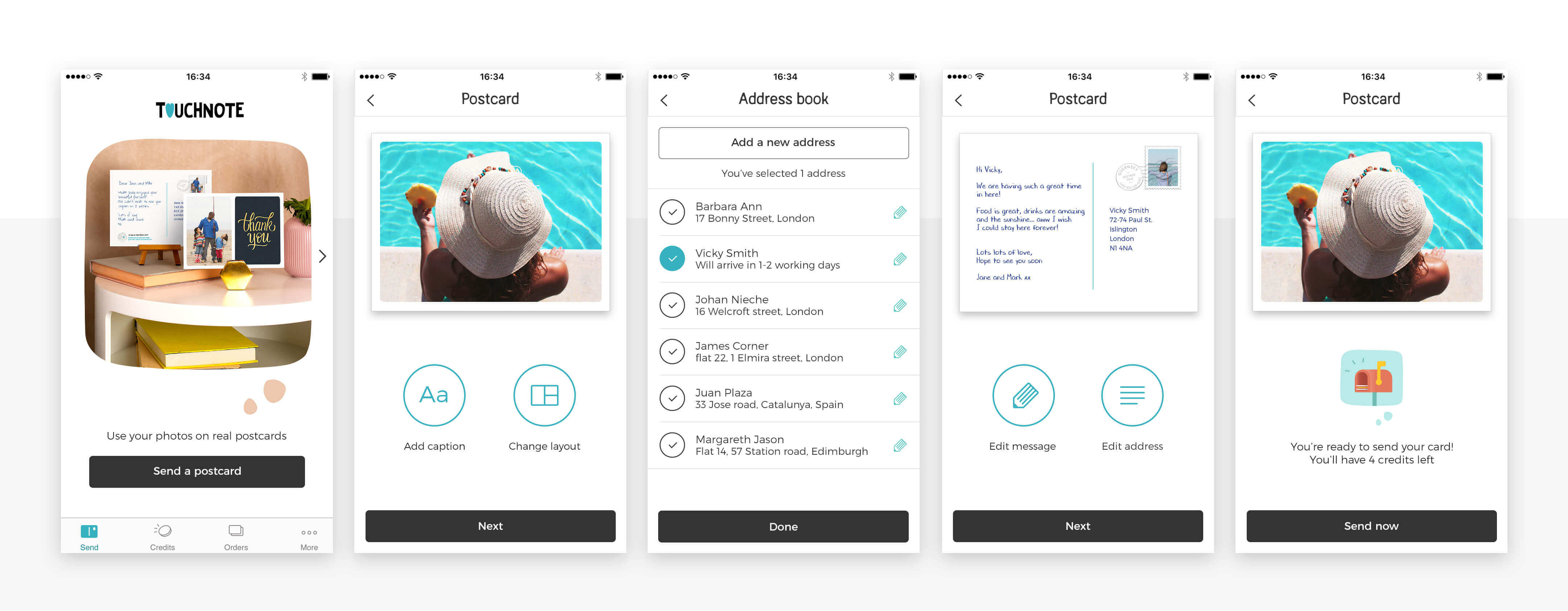
One of the most important goals was to improve the decision making process through a clean UI/UX and simple colour scheme repeated across the app. This new design system helped users to focus their attention to the seasonal products on offer. Below an example of the simplicity of the new process, as shown in three simple steps on the website:

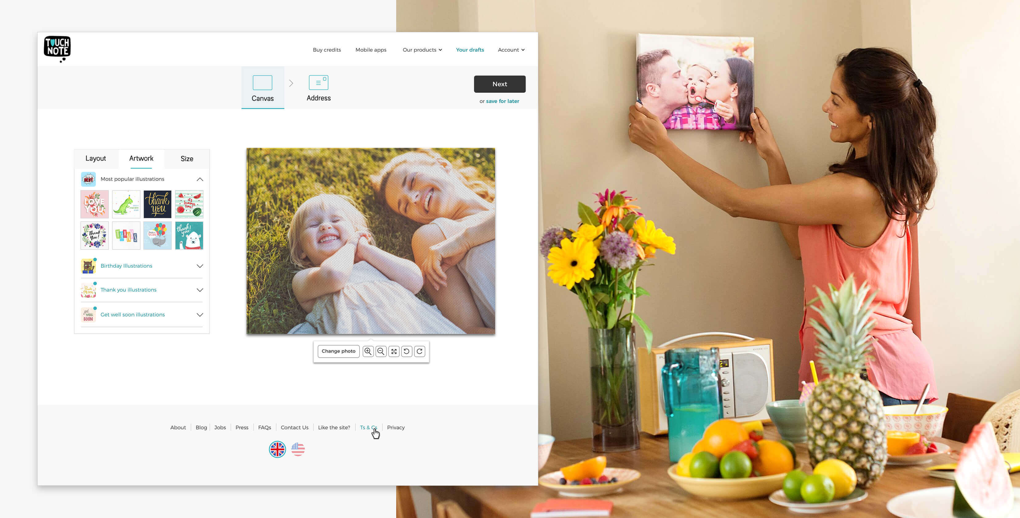
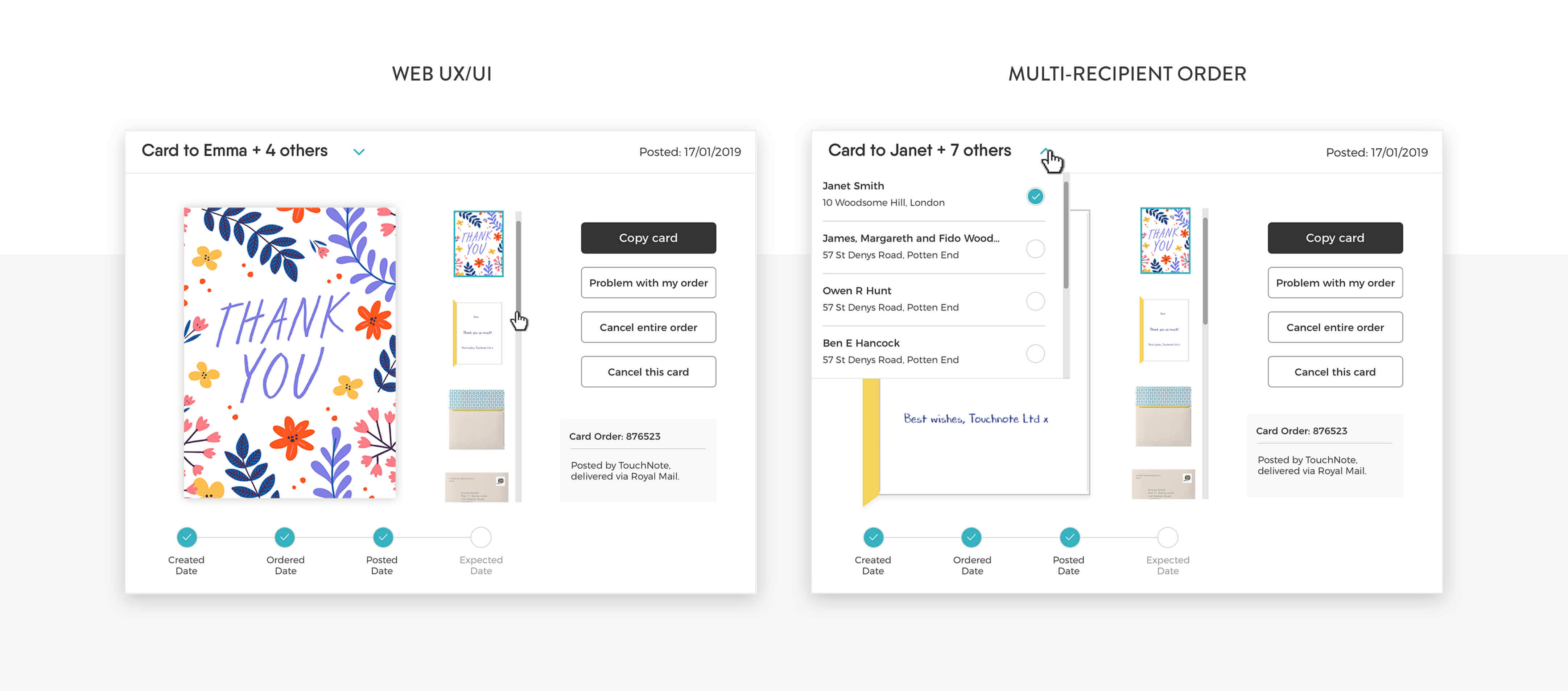
The picture below shows some details of the web implementation, and how the structure has been optimised for a bigger layout when additional horizontal space is available.

A new bespoke icon set & illustrations
Along with the redesign of the apps, my team and I worked to unify the iconography. I enjoyed creating a brand new set of icons that reflects the sentiment and character of the new logo. The set has been designed in Illustrator, then brought to life through micro animations with After Effects.

Animations
The illustration set has been meticulously animated to breathe life into them and elevate the user experience across the ecosystem. I used Adobe After effects and the lottie plugin for a quick integration and to retain the motion quality.


Palette & colour hierarchy
Building a new colour Palette was among the most ambitious achievements of the rebrand, looking to give a new definition to our apps and mostly important to improve the decision making of our users.
